TriNetX
Aug 2016 - Jan 2017
in 2017 TriNetX underwent a rebrand. I led the redesign of their site - starting with the home page. This case study details out the concept progression from the initial 3 concepts presented to the client to the final design that was chosen.
TriNetX is a health research network connecting patient and hospital data
The design process started with wireframing out different concepts and directions that the concepts would take. I wanted the idea of a network to be conveyed, reflecting the nature of how their company operates. Other themes that I wanted to be presented in the designs were around the patients that TriNetX ultimately helps as well the software itself that connects their clinical data with hospitals.
Visual Design Concepts
The standard process at the agency I was working at was to present 3 initial home page concepts that would drive the visual design of the rest of the redesign. The client then chooses a concept (or aspects from multiple concepts) to move forward with. The client was very particular for this project and what was supposed to be 3 concepts eventually became 7 concepts before landing on the final design. Here is the journey:

Concept 1: Highlights the TriNetX software as the focal point

Concept 2: Illustrated concept playing off the theme of the hospital and research buildings coming together

Concept 3: Uses the idea of the patient as the most important aspect of the business's goal

Concept 4: After showing the client the original concepts the design theme shifted towards highlighting the "network" aspect in the design

Concept 5: Continuing down the "network" path, this concept also highlights the 3 pillars that the health research network sits on

Concept 6: Further exploration into the network vs. 3 pillar approach

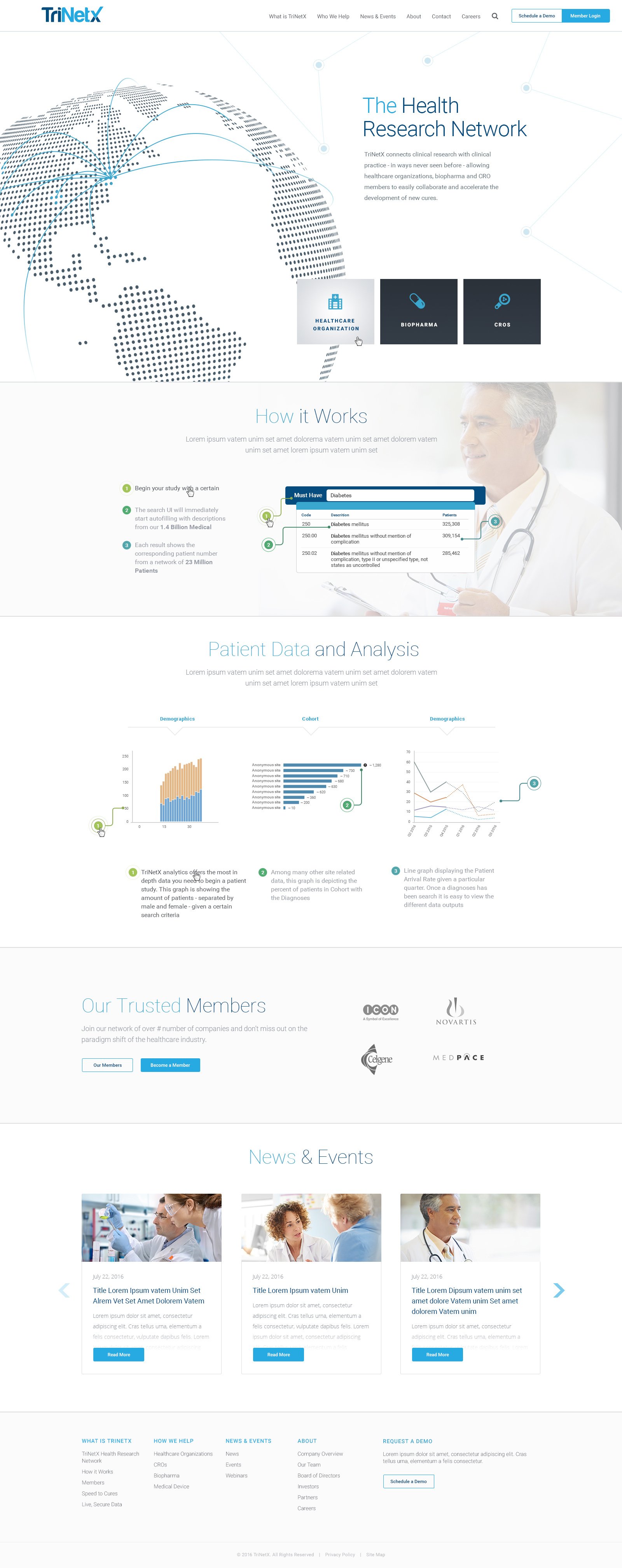
Concept 7: The final design iteration that was chosen as the basis for the site redesign. It ties together the theme of the patient as the focal point with the network overlaid on top of them


